Over the last two years, I've grown considerably more comfortable with statistics. It wasn't all plain sailing though, I've jumped between more than twenty books in order to piecemeal together an understanding of the topic.
Despite all the material out there in the interwebs, I never came across a no BS guide to doing statistics as a PM. Hence the need to write this material as big blog post. I'm aiming to skip over almost all the math part and instead focus on using stats as a hammer for getting stuff done, rather than as a theoritical literature.
**Note: ** This guide is not for statisticians, it's for PMs who want to do data but aren't willing to spend the 2 years learning about math.
Distributions
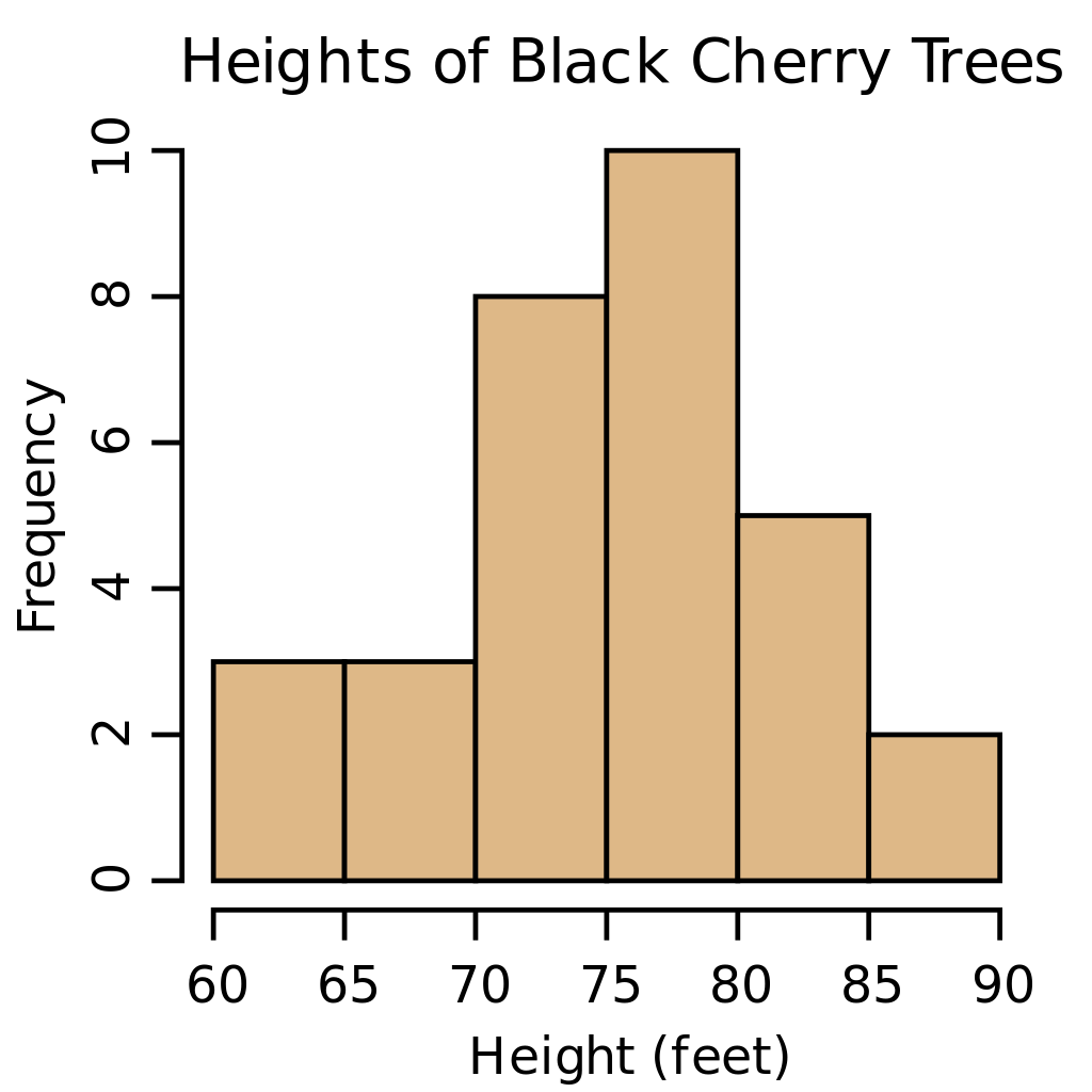
Distributions, often displayed as histograms (also as boxplots), count the frequency of values in your dataset. The most common distribution is the normal distribution, it follows a bell curve pattern (see the above image for context).
Tools:
Mean & Standard Deviation
The mean is the average value of your dataset. It is the highest point in your distribution as it contains the most frequent value.
The standard deviation is the distance of all the points in the distribution from the mean.

The mean +- 1 standard deviation, represents 65% of all the values in your distribution. The lower your standard deviation the more tight your distribution will become as the distance from the mean is smaller. Likewise the higher your standard deviation is the more spread out your distribution will be.

Tools:
Correlation
You've probably heard the term "correlation doesn't mean causation" thrown around a few times in your PM career. For the most part those people are correct, correlation does in fact not equate to causation. But it's a good indicator that two things might be linked and be worthy of an A/B test.
So how do you go about testing for correlation? First, head to your data tool of choice and grab two sets of data that you wish to compare. They have to follow the same timeframe as you want to measure the trend of one dataset against another.

Make sure that the data when presented in a scatter chart does in fact appear to be correlated in some way. Use the above image for reference.
After that, head to a correlation coefficient calculator, input your X, and Y values and hit submit. You should get back a value that's between -1 and 1.
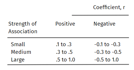
Using the table above you can infer how correlated the two datasets are, the aim is to have a medium or large coefficient.
Tools: